Personalized Wealth Management
NetX 360 is a B2B platform for broker-dealers, wealth managers and advisors onboarding and collaborating with clients more effectively, and stay connected on the go.
The new dashboard aims to proactively deliver personalized and contextualized information to users throughout the day. Beta version was launched for BNY’s annual conference INSIGHT on June 2019.
My Role
As a UX designer worked with my manager to edesigned the Homepage Dashboard, we collaborated with 2 data scientists and 5 software engineers to define the behavior of the ML system and iterated this ML-empowered experience with our visual designer.

Understand The Landscape
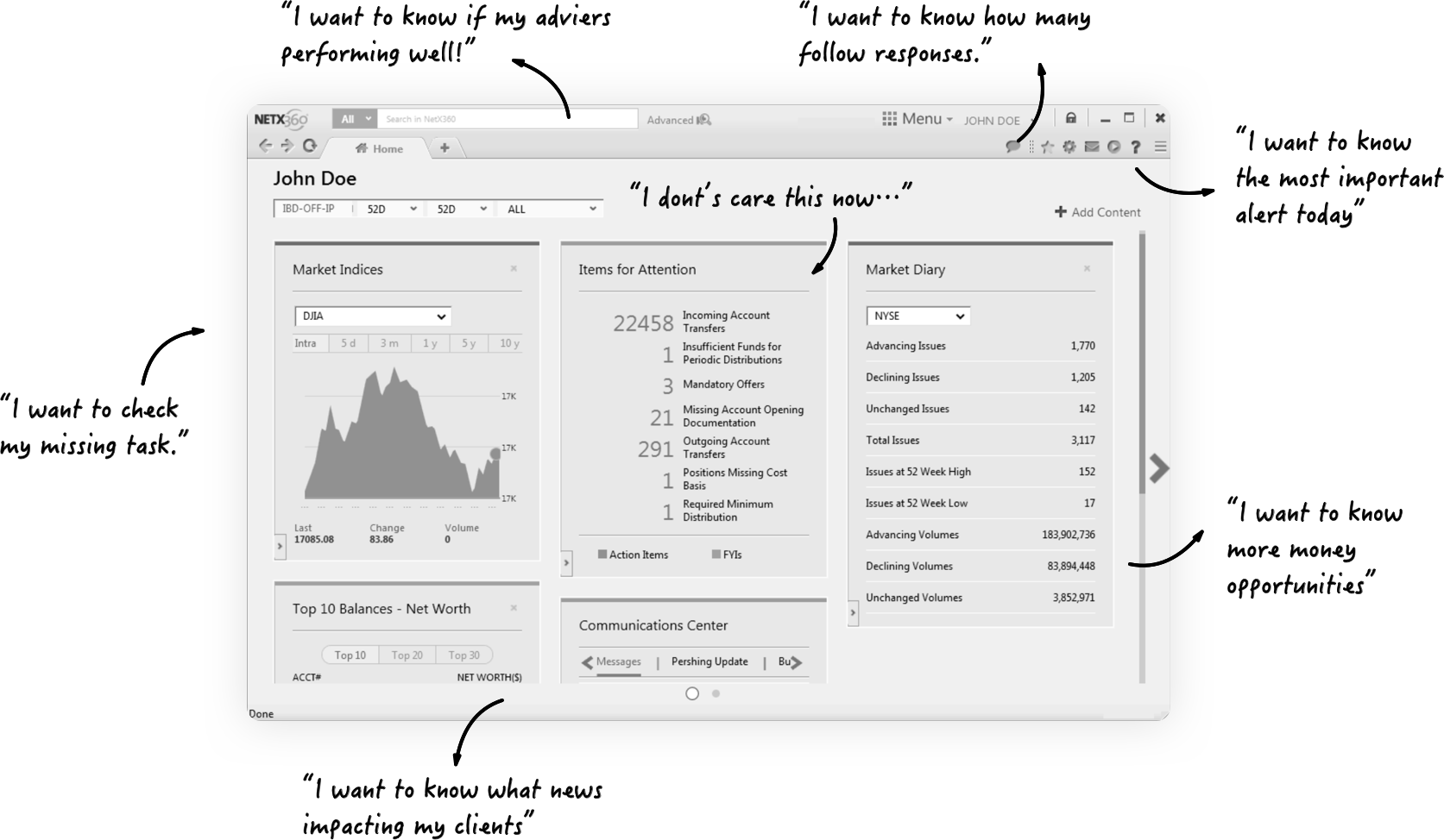
Previously created a customizable dashboard to avoid the Drawbacks of a One-Size-Fits-All Experience, and keep iterate to become more personalized than customized.
Key Findings
Over the past few years, clients have become more demanding, the markets more uncertain and financial products more complex. Users want to have:
-Personalized navigation
-Optimized content
We are thinking about how to create a new design that provides Data-driven personalized information that is relevant and optimal to users so that it helps the user for decision making.
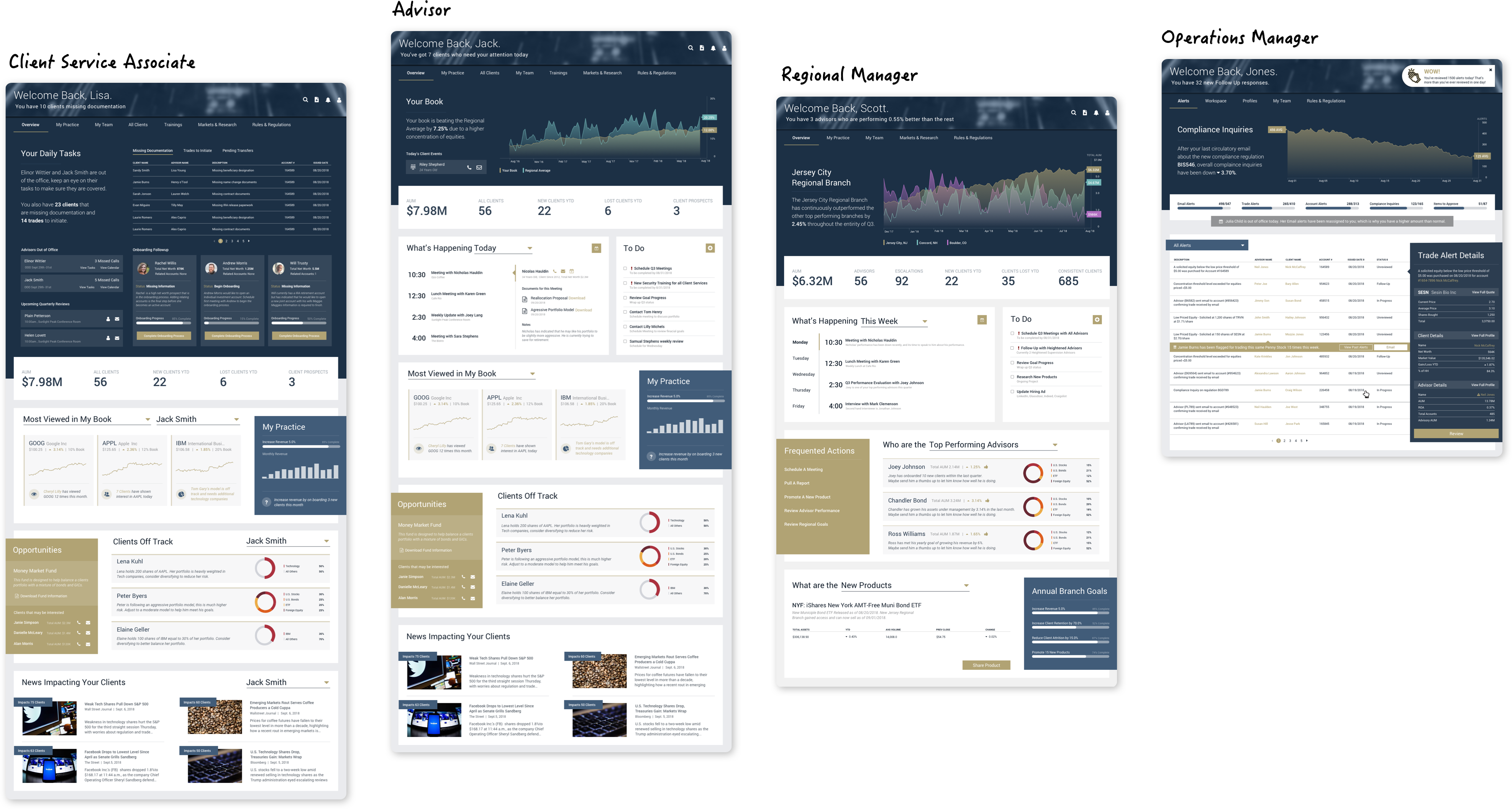
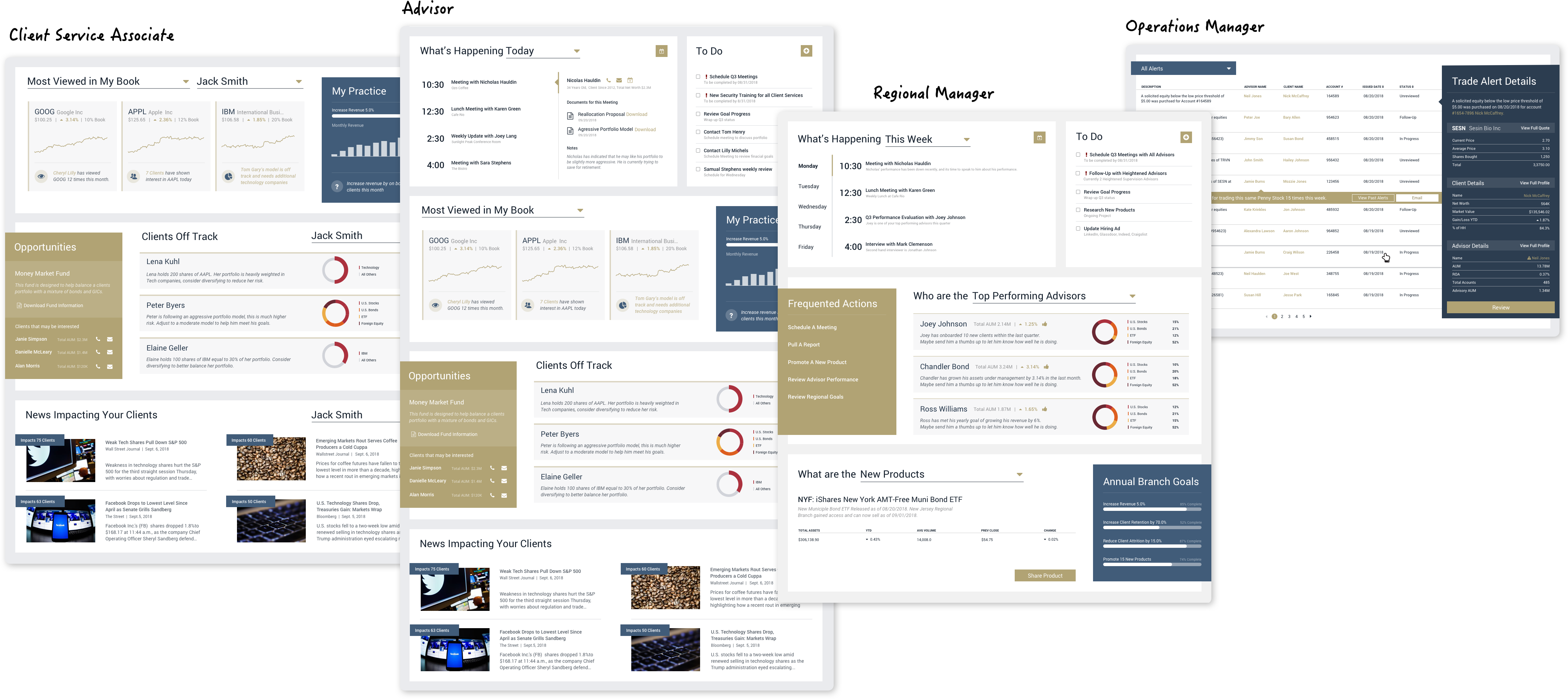
Role-based Personalization
Different type of users needs different content.
Users would have to go to different pages to get all the needed information they want. And for an advisor, client service associate, operations manager, regional manager, the content needed and navigation path is completely different.

Insight & Solution
1. The new user has to spend a lot of time to learn feature location first to configure the dashboard for themselves.
Solution: Redesign the navigation to guide user step by step.
Pattern: relevant information + call to action
2. Users are unsure of features and their values.
Solution: Redesign the data visualization match user’s understandability.
3. User likes to learn deeper to improve their skills.
Solution: Hide irrelevant data, and prioritize the relevant information.

Design
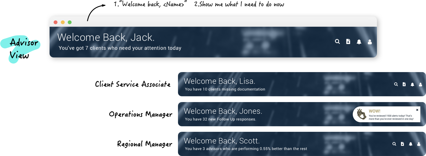
Data-informed Headline
Action: Converted raw data into key insights which users can take actions on immediately.
Users: "This is exactly what I want. With this (key insights header), I don't have to spend hours reading the report."
Dynamic Navigation
Action: Hide tabs that are not commonly used
Users: "I like this. Now I can quickly scan through pages that I have to take action with."

Personalized Modules
Action: Provide relevant data and data visualization to help user make decisions.
Advisor:Self performance, Client Status, Client Event, AUM...
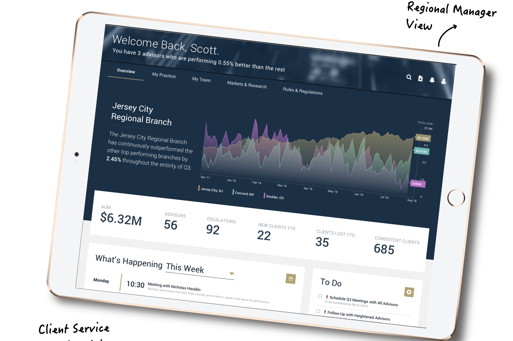
Regional Manager: Advisor’s Performance, Regional Growth
Client Service Associate: Daily Task, Missing Document, Trade Status, Pending Transfer
Operations Manager: Alerts, Team’s Status
Users: "This is great. With this, I feel more motivated to start reading data and documents"
"Wow. This will save me lots of time. I only care about the alerts related to my daily work."


Relevant Content & Event
Action: The secondary performance information or financial news can be updated to surface relevant content, events, and other engagement or investment opportunities for our users based on what we know about them.
Advisor: Daily Review, Client Off Track, News Impacting Clients, Investment Opportunities
Regional Manager: Advisor’s Allocation, Collaboration, New Product Review...
Client Service Associate: Most View, Potential Client...
Operations Manager: Alerts, Alert Details
Users: "This is really cool. Now I can get a better picture of the root cause of customer's dissatisfaction."
“I like to review new product and policy after finish my work, very helpful for career improvement.”
Whole Page