Pershing is a subsidiary of The Bank of New York Mellon, the longest-lasting financial institution in the United States.
Data Monitor Redesign
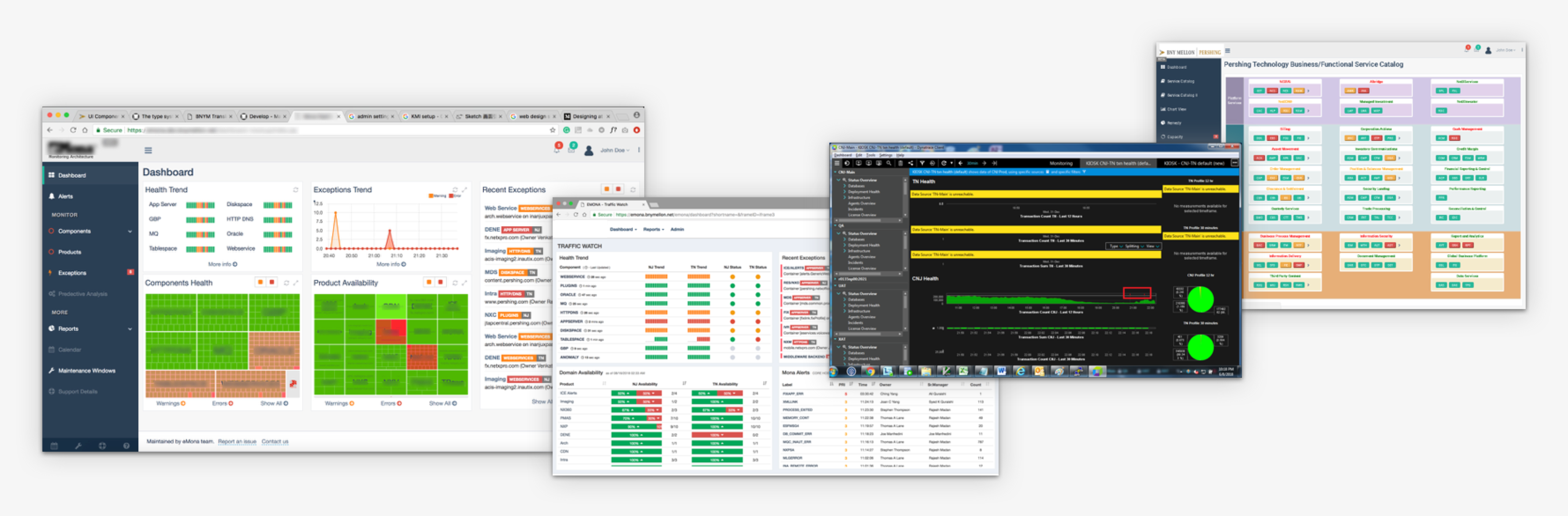
Pershing has been building multiple monitoring tools and dashboards for its 30+ services around the world. The business goal is to combine them into one consolidated dashboard.
Monitoring Dashboard is one of the biggest redesign projects I am in charge of at Pershing|BNY Mellon. It cost 4 months for my team to do research, design, test and iterate. The goal of the redesign is to help our users to get their job done faster and smoother, which in turn makes their lives much easier.
My Role
Researcher: I interview users and gather feedbacks about current menu building process. I analyze support tickets and data to drive design decisions. I dig deeply into users' real needs behind the scene.
UX Designer: I cooperate with other team members to utilize the research results and bring conceptual ideas and solutions. We reconstruct the information architecture, redesign user journey, and build an efficient tool to help our users to achieve their goals.

Problem of current product
Previously, Pershing has too many monitoring tools and most of these website's information is very miscellaneous and the goals are diverse, and the UI style is way out of user's expectation.
Un-happy path: Hard to tell where is the problem of the system.
Lack of bridge context: Hard to know who can fix the issue.
Hard to navigate: Hard to find/edit/create a ticket or required object.
Who are the users
- Operation Team who fix issues.
- Concession Managers who manage the applications or services.

Goals
1. Refine information architecture to make monitoring system simple and customized for 2 different types of users.
2. Design experience details to complete a well considered user experience.
3. Standardization of UI to ensure a consistent branding.
Brainstrom & Draft
I cooperated with the PM and the product lead to understanding our old information architecture and reorganized it into a more reasonable structure. We built a new user journey based on that, and redesigned design patterns to make it smoother and more user-friendly.

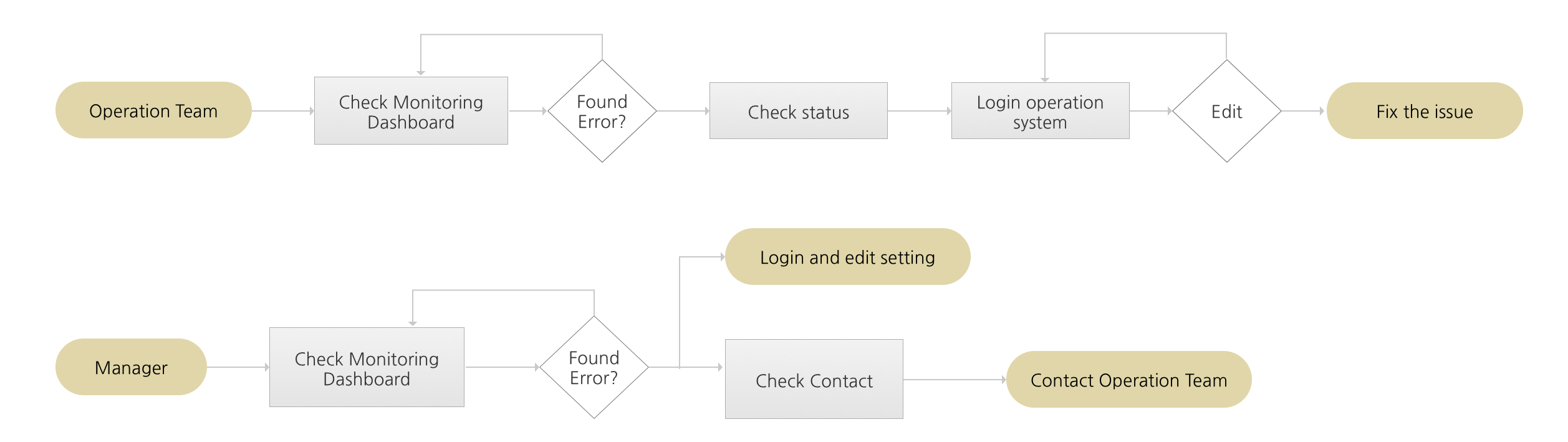
Use Flow
Before diving into a specific UI design, building a use flow chart helped me comprehend the product from a global perspective.
Information Architecture
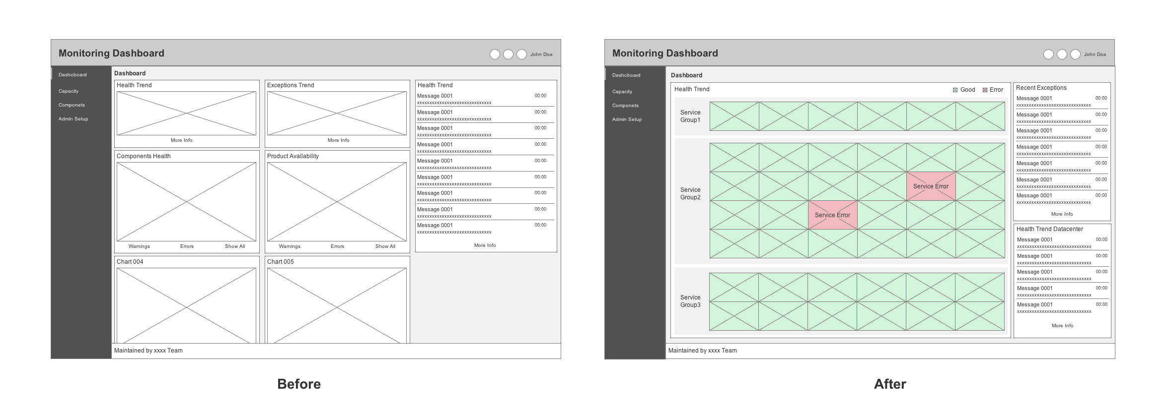
After the internal interviews with Managers and Operation Team Leaders and breaking down the current system, we found that we have too many professional charts on the home screen. Only professional programers understand, but managers don’t.
We are looking for a bird’s eye view screen which enable all level users can simplily tell which service has problem.
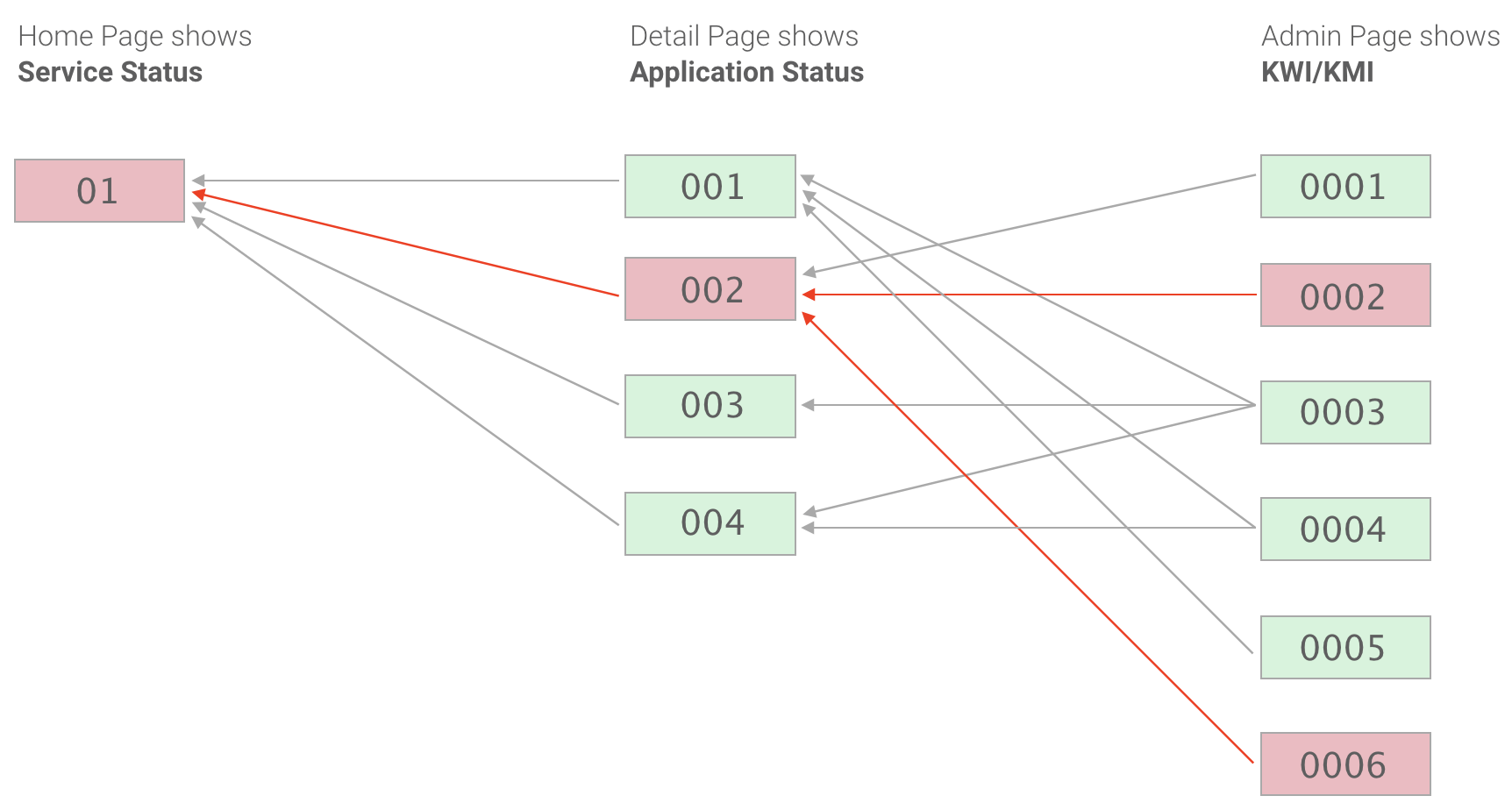
How it works
There are multiple applications in each service, and there are multiple KWI/KMI represent the health trend of the application. If one of the KWI/KMI has an issue, might affact multiple applications, the worst case is the highest service offline. (The relationship of Service, Application and KWI/KMI see below)