UI Design
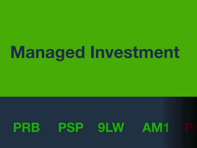
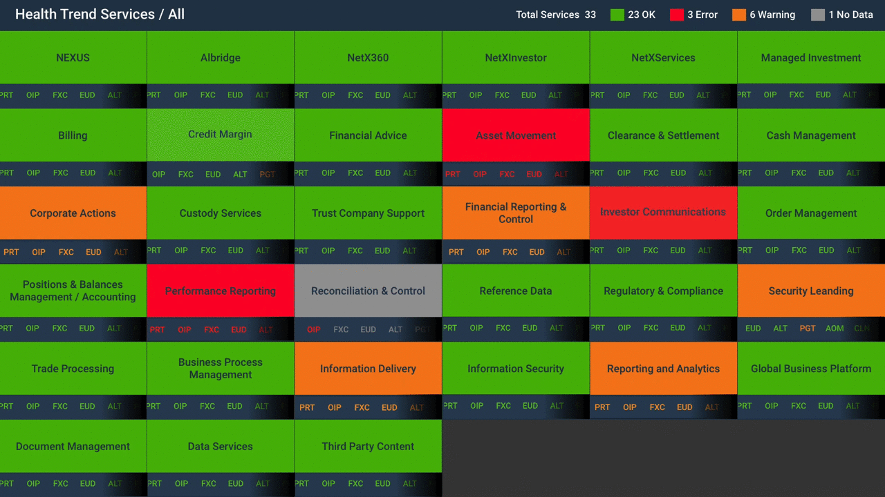
The redesigned Monitoring Dashboard Home Page mainly consists with one Health Trend System Overview conponent, and two message notification conponents. The Health Trend System Overview conponent consists of 33 boxes, each box represent 1 service.
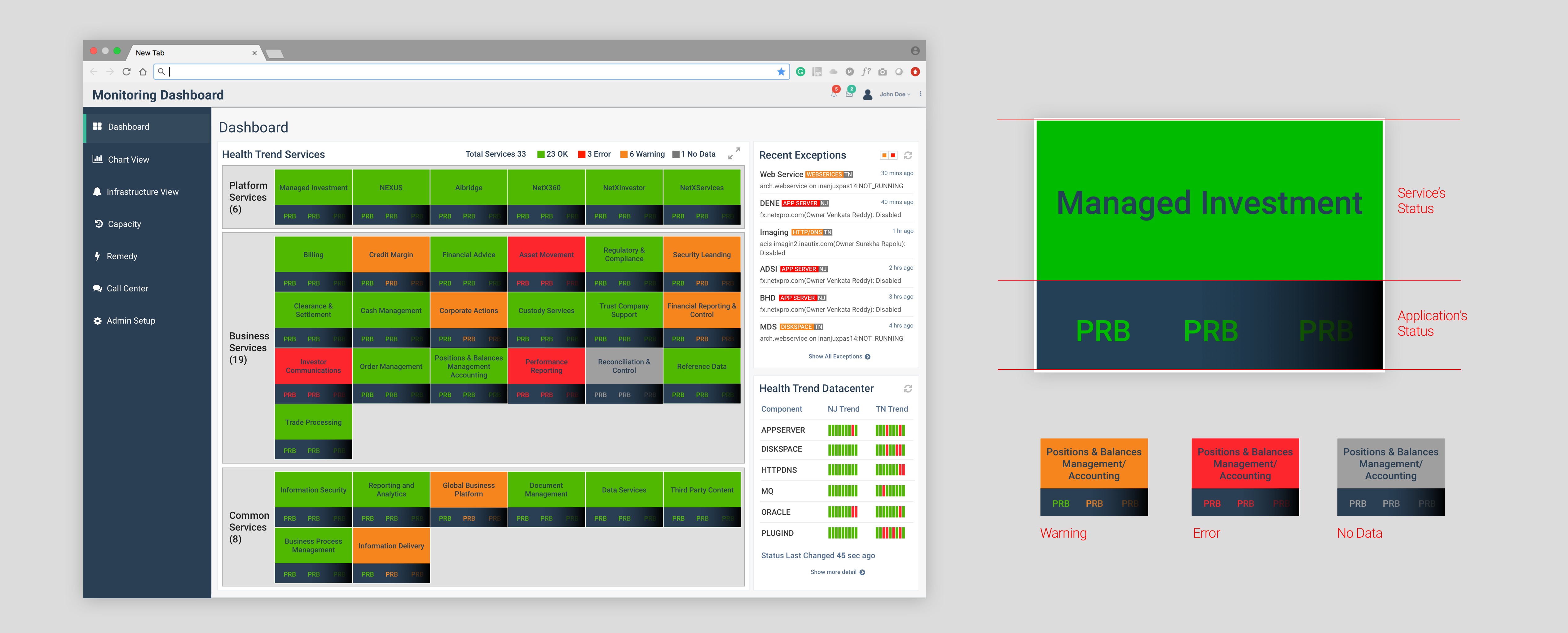
Dynamic Dashboard enables user check the Service Level status and Application Level status as the same time. Considering most of our users are working in financial environment, this “stock ticker” style monitoring dashboard will be very friendly to all of our target users.
Full Screen Freature this dynamic data viz home page will be displayed on big screen monitors in the whole buiding. Enabling all employees to cristal clear know the really time health trend of all the service in the company.
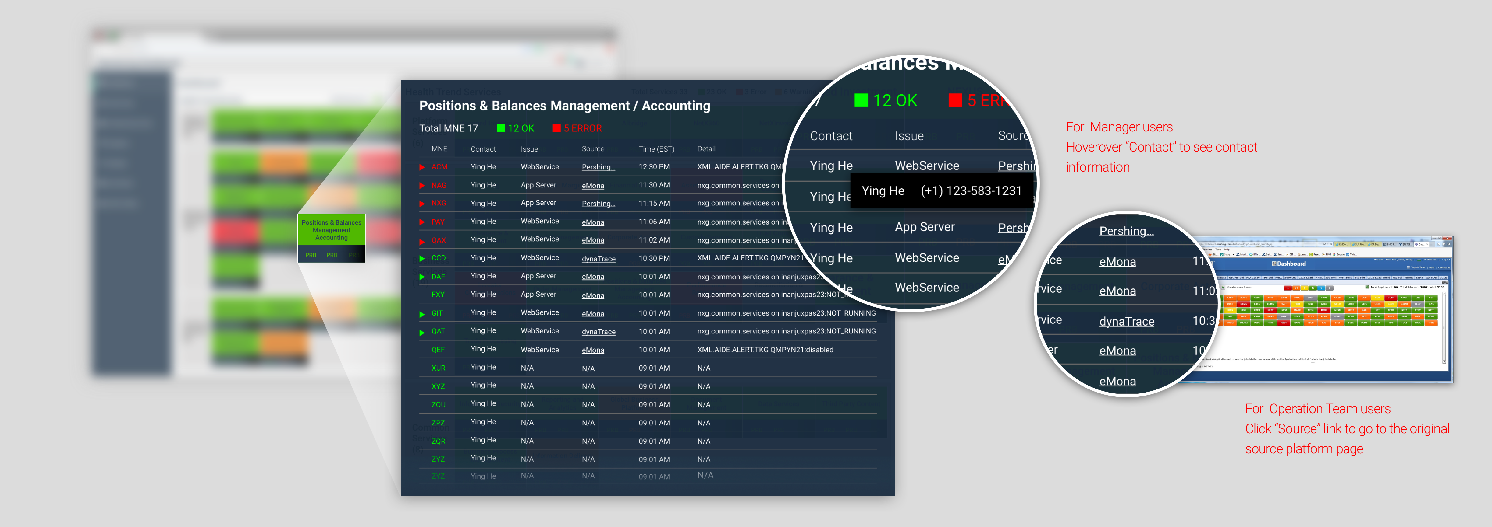
Pop Up Window Service Detail Page this one click popup window enables users to check more detail about the service, including how the problem happen (error history), who is the manager of the service. This screen is for peopel who is about to take action to fix issues when they noticed that something went wrong in the system. You can easily check:
1. How many applications totally in the service
2.How many of them have issue.
3.Error message history.Each row inside the form represent a single application.
4.Who to contact to fix the issue.
5.Link to the external platform.