UBER AIRPORT
UX ideas for UBER airport
PROBLEM
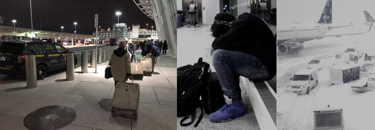
When people first come to a new place, they might be more anxious than excited sometimes. Imagine an Asian girl who took a 28-hour flight coming from Beijing to New York, and her flight is delayed by a storm. Now it is almost 23:59, not many people around and dark outside. She wanted to order an Uber, but she was afraid of speaking to a foreigner. --That is me, I still remember when I first arrive at America, JFK, everything was new, I didn’t know how to start a conversation with foreigners, I didn’t even know how to explain where I am, it is very scary. I ended up with calling a Chinese cab to pick me up. Ironically, I once work as a Uber driver in China many years ago.
I love our Uber community, I want to create something for Uber Airport enable us to brake the boundary of language.
SOLUTION
Culture Problem
Sometimes language and culture different are big problems. But I noticed that last July Uber release an app which offers basic sign language tips to chat with deaf or hard of hearing drivers. Such a warm idea! It reminds me the project that my mentor Ota Yukio did many years ago which named LoCoS.
What is LoCos?
LoCos is a universal language by 2065. Called the Lovers’ Communication System, or LoCoS, the standardized system based on pictographs has the power to overcome language barriers and revolutionize the world of communication as we know it.
Who is Ota Yukio?
Ota Yukio is a legendary graphic designer in Japan. As the creator of the green “running man” pictogram that is featured on the nation’s emergency exit signs which have since spread to Europe, Canada and the Asia-Pacific, Ota is a frontrunner when it comes to developing images that convey a thousand words.
Base on LoCos we can create a universal language for the Uber community, not just about giving more empathy to disabled people but optimizing the usablity to the whole community system.


Way-finding System Problem
I’ve worked as a way-finding system designer for 2 years in China. In this case for Uber, I considered how to redesign the last 500meter/ 1640ft pick-up experience that would enable our drivers and riders to find each other in an easier way. Here’s an idea to make it more clear for the driver to identify who they’re picking up, and for the passenger to feel more confident that they’re being picked up by the right driver.
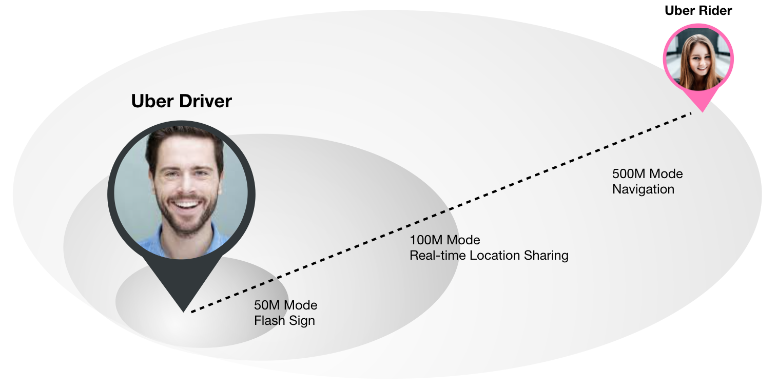
Here I setup 3 modes: 500M Mode, 100M Mode and 50M mode. When you get closer to each other, less than 500M/ 100M/ 50M, your map would automatically switch to a specific mode which shows you more details that you need in that situation. I will show what driver and rider see in different mode.
The Last 500M Mode
When Uber detects the distance between you and your driver is less than 500meter/1640ft, the rider side will swich from the original birdview mode into the navigation mode. It amis to show you the best way to find your driver outside the airport.

The Last 100M Mode
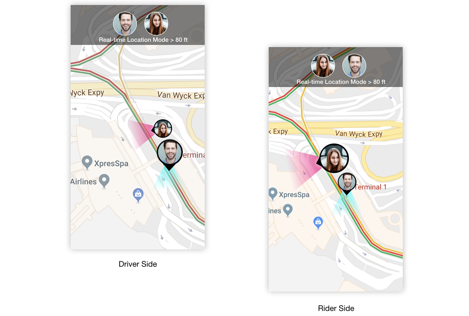
When you get closer and closer to each other, less than 100 meters, the real-time location sharing might be a good way to see if I am on the right direction to my driver.
The Last 50M Mode
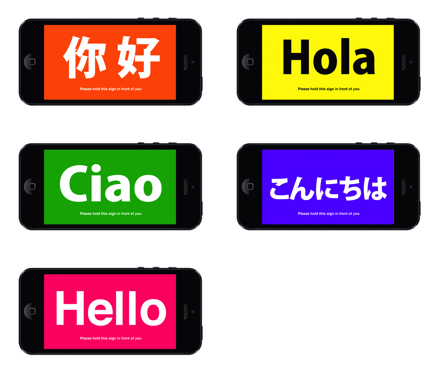
For the last 50 meter mode, I need to consider another problem, how to use a simple dynamic interface to help driver identify you or how you can identify the driver. I think that is important, especially in the airport.
This problem of drivers and riders being able to identify themselves at a fixed location has been solved long ago. Do you still remeber when you get off a plane, head to the baggage claim area, and you’ll see drivers holding up signs with people’s names.
In the case of Uber, the driver isn’t the one in the fixed position. The rider is. So rather than the driver holding a sign from within their car, the passenger should be the one with the sign.
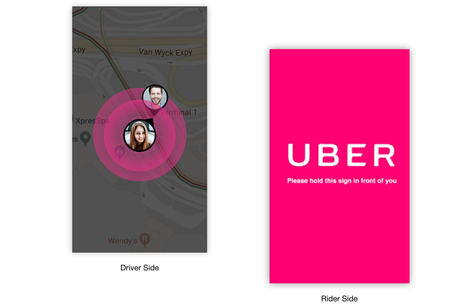
As the driver approaches, the Uber app rider side switches from the real-time location sharing mode, to a flashing sign, it will attract enough attention. Then Uber tells you to hold your phone up so the driver will see you.
On the driver’s side, it would show a color range circle poping up that let them know to look out for the passenger with the color flashing sign.
On the driver’s side, it would show a color range circle poping up that let them know to look out for the passenger with the color flashing sign.
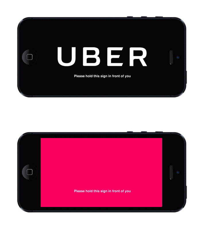
Flashing Sign
Most of the time bright color is a powerful thing to attract people’s attention, but what if a driver was color blind? Since Uber is designing for global users, I should keep any extreme situation in mind during the process. Besides of using full screen color flashing sign, I consider adding different form such as circle, triangle, and maybe a unique gourp of digit number.
As I mentioned before, I think we should create our own universial language which we can use in recognition system and internal communication system.
Here I use normal graphic element as an example to explain how I design a standard use of the flashing sign.
In order to make a programable and identiable sign we need to setup some basic standard as designing a visual identity system. Here is a set of basic rule that needs to be follow:
--Basic graphic
--Max/Min Size
--Safe Color Domain
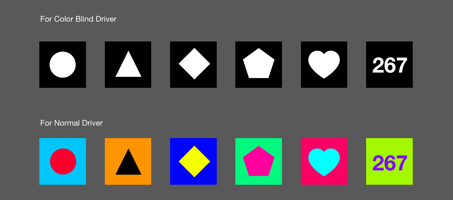
Basic Graphic
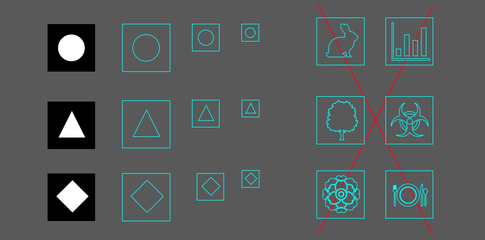
Max/Min Size
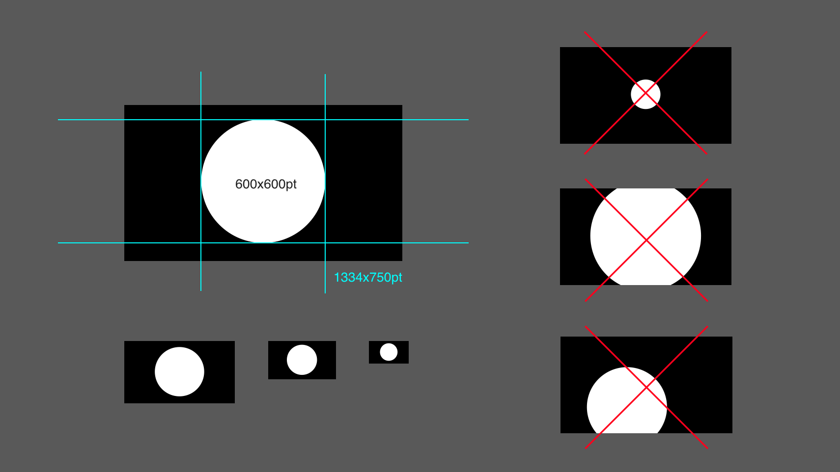
Safe Color Domain

User Testing
When I finished the basic design process, the next step is the second round user testing. This testing is mainly focus on measuring if the flashing sign works well in the real world. In most cases I setup 3 types of testing:
--Recognition testing
--Usability Testing
--Readablity Testing
![]()
We will start the testing during day time, night time, and also mimic some extreme situation such as high speed movement, most of the area is obscured, heavy rain and snowing weather.
Airport is one of the most important place that Uber saying the first warm “Hello!” to our customers.
I started with reseaching and redesigner the Uber Airport pick-up feature, and discovered series of unseen design opportunities during the process that I did not realize in our daily lives. I wish we can some together to create more humanistic concern designs to the whole Uber family , as the most important mission of Uber once mentioned "Transportation as reliable as running water, everywhere, for everyone".
When I finished the basic design process, the next step is the second round user testing. This testing is mainly focus on measuring if the flashing sign works well in the real world. In most cases I setup 3 types of testing:
--Recognition testing
--Usability Testing
--Readablity Testing

We will start the testing during day time, night time, and also mimic some extreme situation such as high speed movement, most of the area is obscured, heavy rain and snowing weather.
Airport is one of the most important place that Uber saying the first warm “Hello!” to our customers.
I started with reseaching and redesigner the Uber Airport pick-up feature, and discovered series of unseen design opportunities during the process that I did not realize in our daily lives. I wish we can some together to create more humanistic concern designs to the whole Uber family , as the most important mission of Uber once mentioned "Transportation as reliable as running water, everywhere, for everyone".
-
Thanks for reading
feel free to leave your comment via email: ying.he@nyu.edu