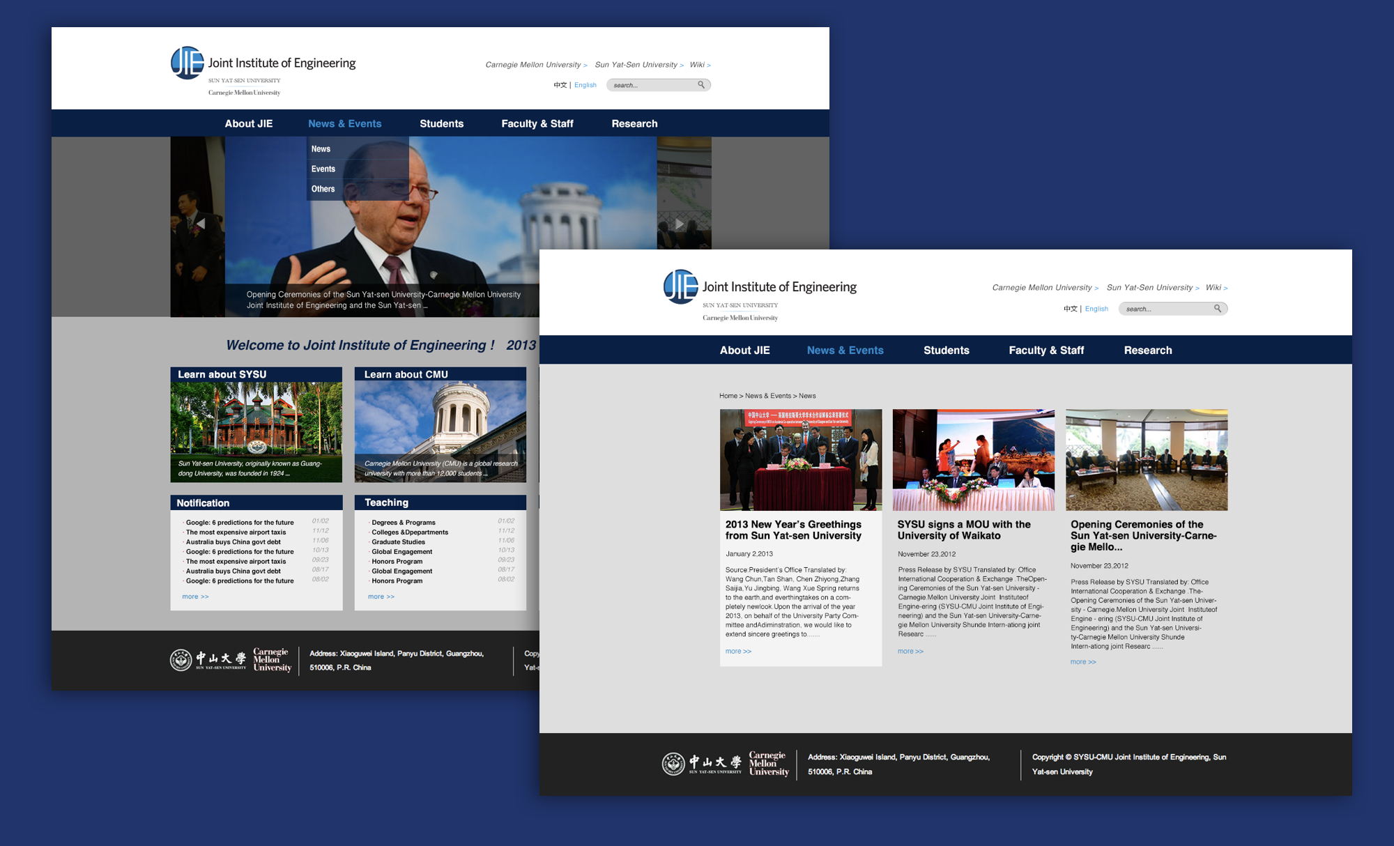
Joint Institute of Engineering(JIE) is an international collaboration between Carnegie Mellon University and Sun Yat-sen University to innovate engineering education. The website of JIE takes the responsibilities of promoting JIE program, logging into online admission application system, and knowing all latest news. It is the first impression of all Chinese students interested in joining CMU-SYSU JIE program.
JIE Website Upgrading
2013 in Guangzhou. China
Teamwork
My Role: UX UI Designer
Client: Carnegie Mellon University / Sun Yat-Sen Universtiy
Tools: Sketch / Photoshop

Problem
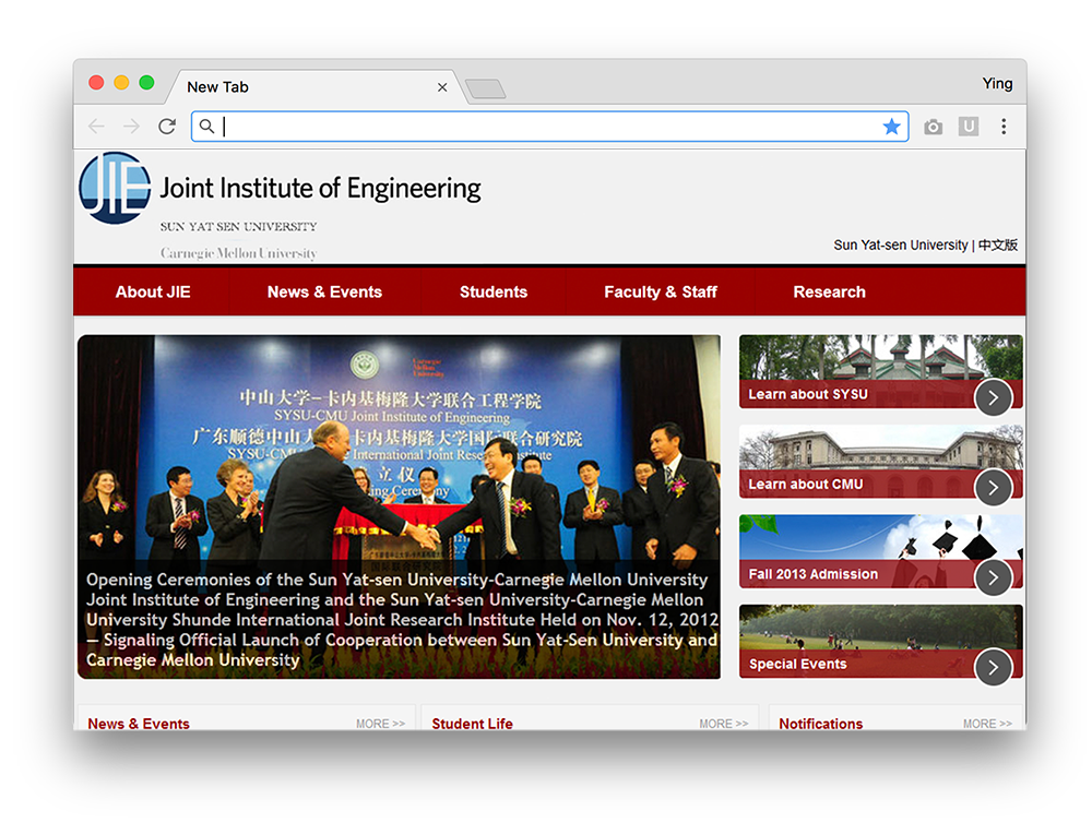
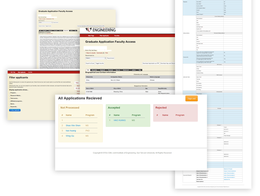
Previously, the website's information is very miscellaneous and the UI style is way out of user's expectation. With the user demand, this website cannot finish the task of better expressing JIE branding, and it is hard for srudents and faculties to work with the admission system. The problems includes:
Home Page
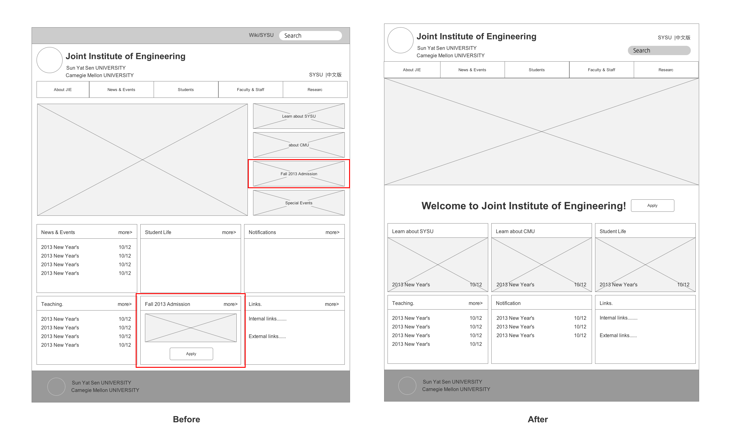
- Miscellaneous information architecture makes using experience not good.
- Lacking user-friendly interaction and considerable details to keep user engaging.
- UI style used in an irregular way, make JIE branding not concisely promoting.
Admission Application System
- The list of questions is too long, more than 100 questions needs to be answered by student.
- Lacking navigation of the process, srudents and faculties will not know how many steps they are working on, and how many steps left.
- Too many type in questions.
Goals
1. Refine information architecture to make admission application system simple and customized.
2. Design experience details to complete a well considered user experience.
3. Standardization of UI to ensure a consistent branding.
4. Simplify the question form and workflow for student and faculty.
Challenges
- Affectively taking over the business insight from strategy team.
- Limited resources and tight timeline, 2 months to finish main pages design and detail UI style guide.
- Transfer deliverables between design and developing team.
Use Flow
Before diving into a specific UI design, building a use flow chart helped me comprehend the product from a global perspective.

Information Architecture
After the internal interviews with student and faculty and breaking down the current system, we found there are alot of dupicate information on the home page and the most important apply button was hidden in 2 different area, this left a not intuitive user pathways to finish tasks. Our goal is to merge the dupicate information and simply the reading path.
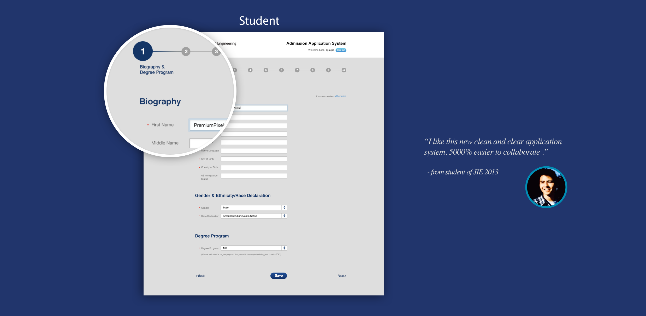
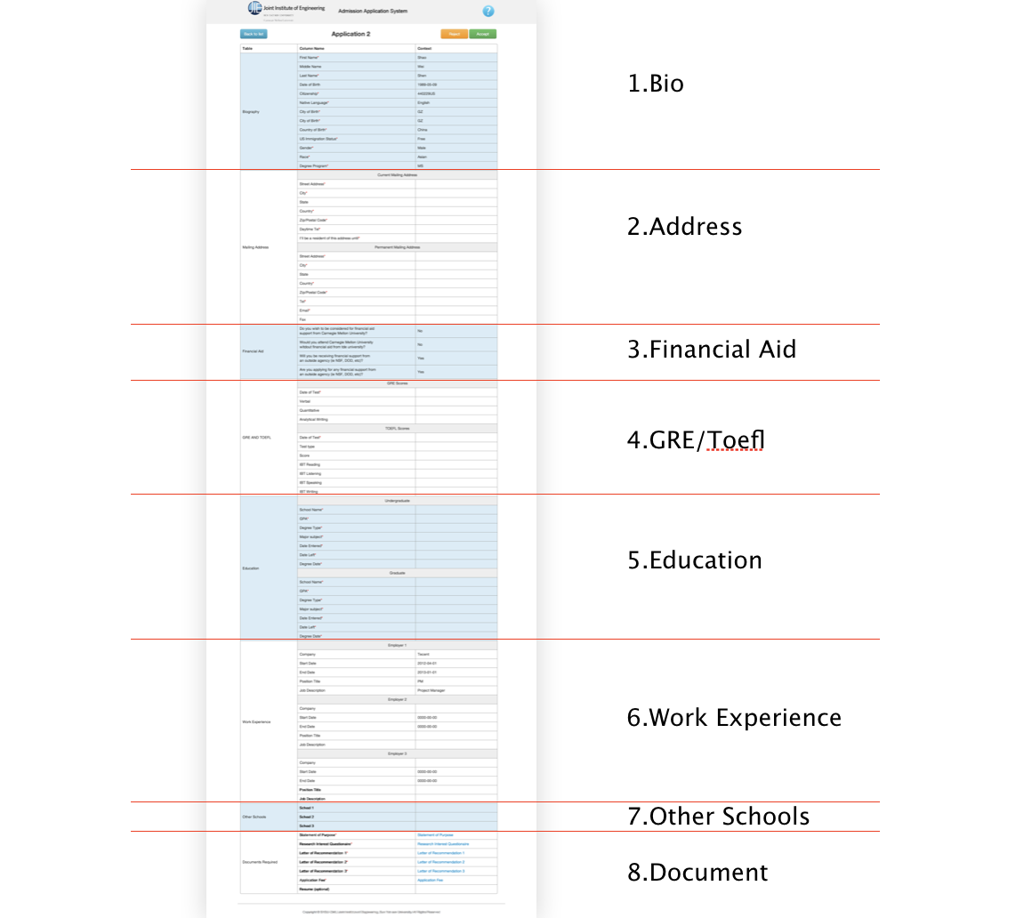
Another problem is how to simplify the admission application form. The question list is too long and the experience is very unfriendly. Users have to answer all the questions by hand type-in. In order to make the process easier and more user friendly, I splict the form in to 8 parts, and add a navigation to show the whole map of the form and how many steps left when I am filling the form.
UI Design
Color System + Process Navigation + Advanced Application Form. The old visual design was follow CMU’s guideline, which makes JIE’s branding not concisely promoting. In the upgrade version we strong the VI system by using simillar color system of JIE’s VI system.
Color System for home page and admission application system

Navigation for home page

Process Navigation for admission application system
Student Site It shows which step you are working on, you can click to save and jump to any step that you want.

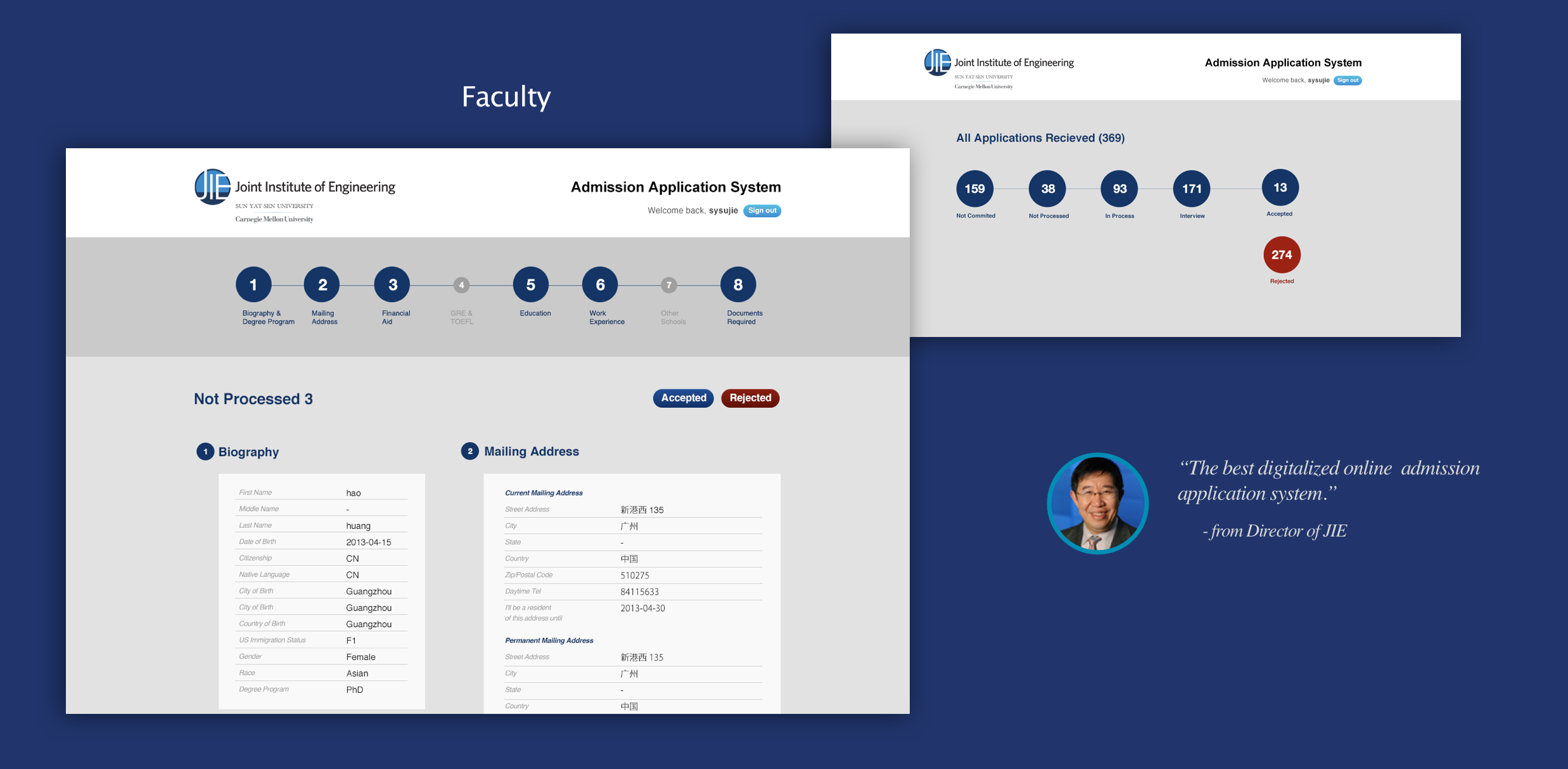
Faculty Site
When faculty login to the system, it shows how many applications are waiting in line, how many are accpted, and how many steps in the whole process.

When you review the application, it shows how many steps totally. It allows you to choose which step you want to review, after that you can switch to review the next candidate info page to compare the contant.

