KAYAK IN OUTLOOK
A new add-ins design for Outlook ios
Project Background
2 Parts Design Challenge-
CHALLENGE - PART 1
PROJECT BACKGROUND
How would you design a Kayak integration into the Outlook mobile app (iOS or Android)?
Tools: Adobe Experience CC, Sketch, Keynote, pencil, paper
PROCESS
PROJECT BACKGROUND
How would you design a Kayak integration into the Outlook mobile app (iOS or Android)?
Tools: Adobe Experience CC, Sketch, Keynote, pencil, paper
PROCESS
- Evaluate user flow with 10 heuristics
- Interview
- Redesign user flow
1. User Flow Evaluation
PERSONA
I got an email from Darren with an onsite interview invitation in Microsoft Campus in Seattle.There fore I want to check and book a flight with Kayak from New York to Seattle for a trip base on the information of the email with Outlook.
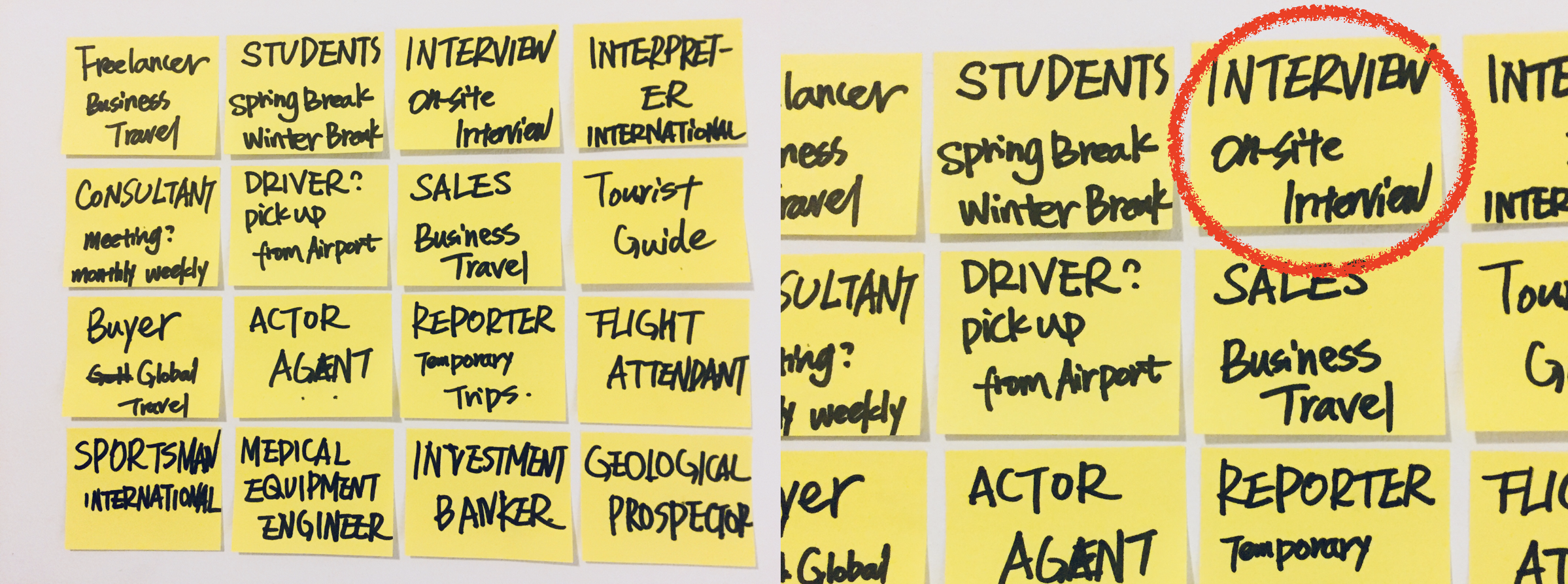
Cognitive Walkthrough
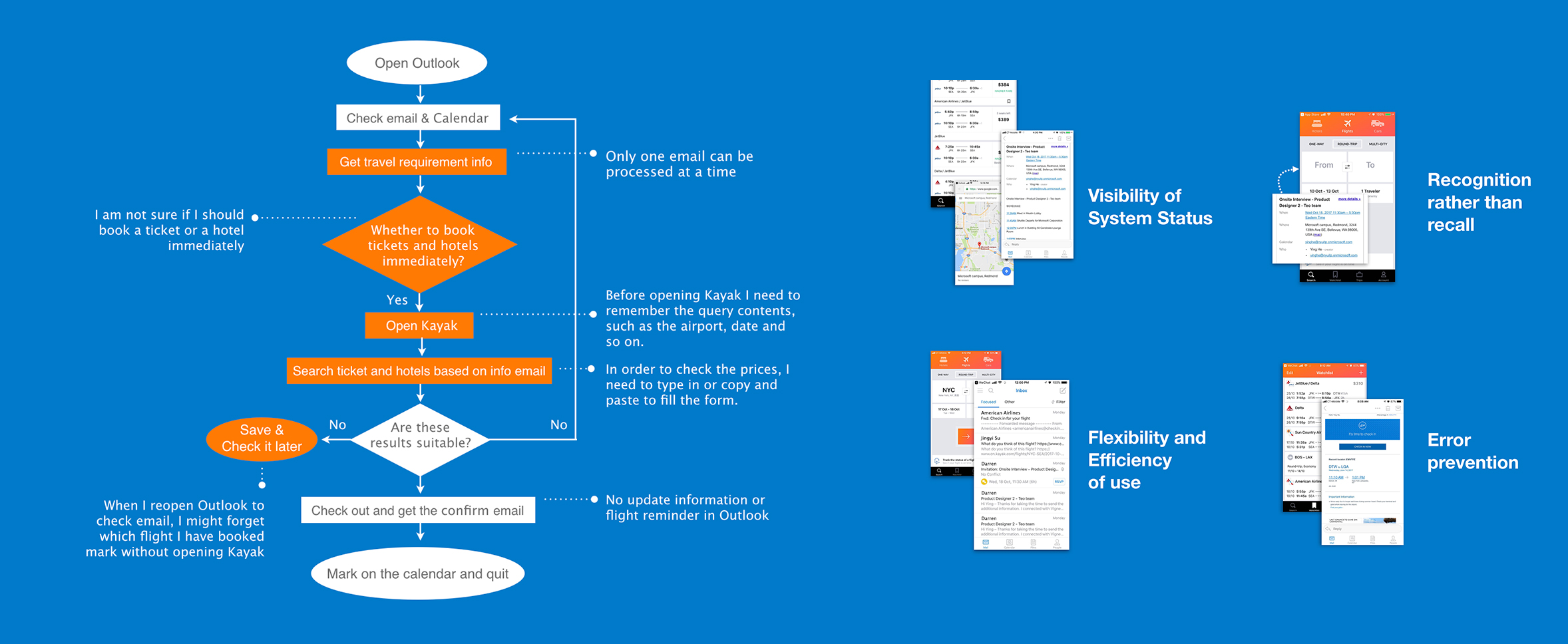
HEURISTIC EVALUATION
There are 4 heuristics that in the whole process has violated to a certain extent that cannot be ignored.
1. Visibility of System Status
2. Recognition rather than recall
3. Flexibility and Efficiency of use
4. Error prevention
- Applications are not interconnected. In certain circumstances, some of the necessary information is not displayed.
2. Recognition rather than recall
- Transferring information by type in and copy and paste.
3. Flexibility and Efficiency of use
- Information push is not targeted
- Only one email can be processed at a time
4. Error prevention
- Flight information will be forgotten after being marked
- No dynamic flight tracking service after receiving the flight information email.
2. Interview
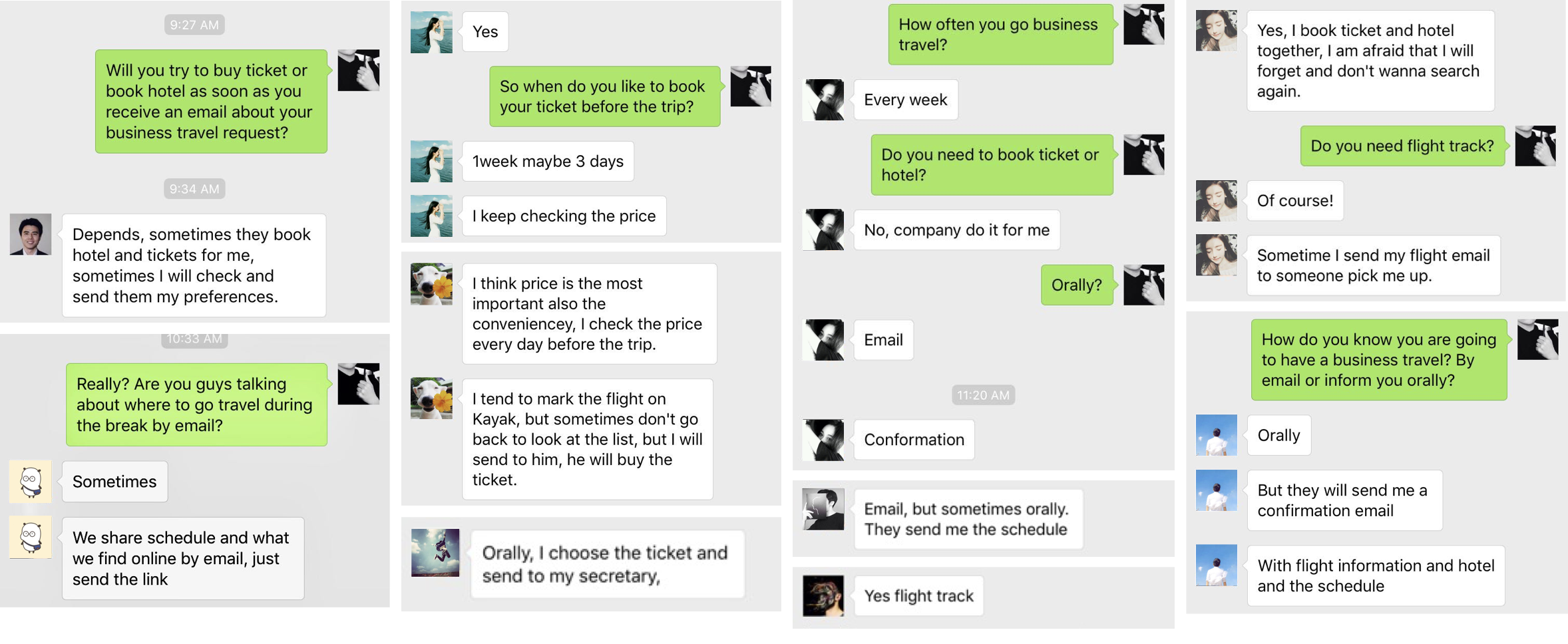
10 QUICK INTERVIEWS
Due to the time limit, I managed to do 10 quick interviews online with my friends in the US and China within 45min, with 7 of them being full-time employees, and 3 being students. The insights are as follows.
INSIGHTS
- All of the participants mentioned that it is very inconvenient that each time they have to fill in the search form
- All consider price as their top 2 priorities except for some emergencies
- 80% participants care about the flight track after they receive the conform email from airline company
- 60% of the respondents mentioned that they keep checking the price and book tickets one week before the trip
- Share travel information by email
3. Redesign user flow
TECHNICAL CONCERN
I am trying to integrate machine learning into Outlook. Based on the text analysis, Outlook will understand where I am, what's the situation, and assist me with different function including automatically fill the search form when I want to check the price, and provide me the flight information when it detects I am going to the airport.

DESIGN HIGHLIGHTS
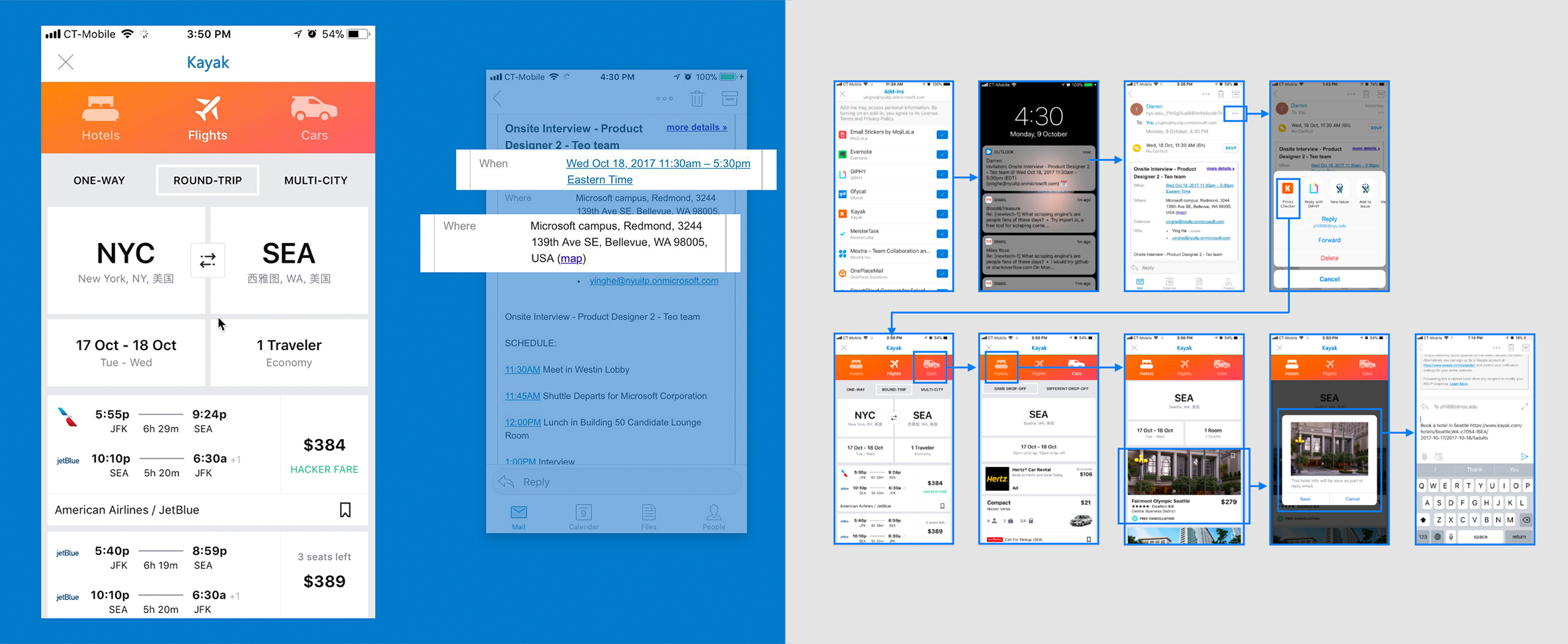
Based on research, I try to design the Kayak integration user flow in the following aspects:
1. Prices Checker
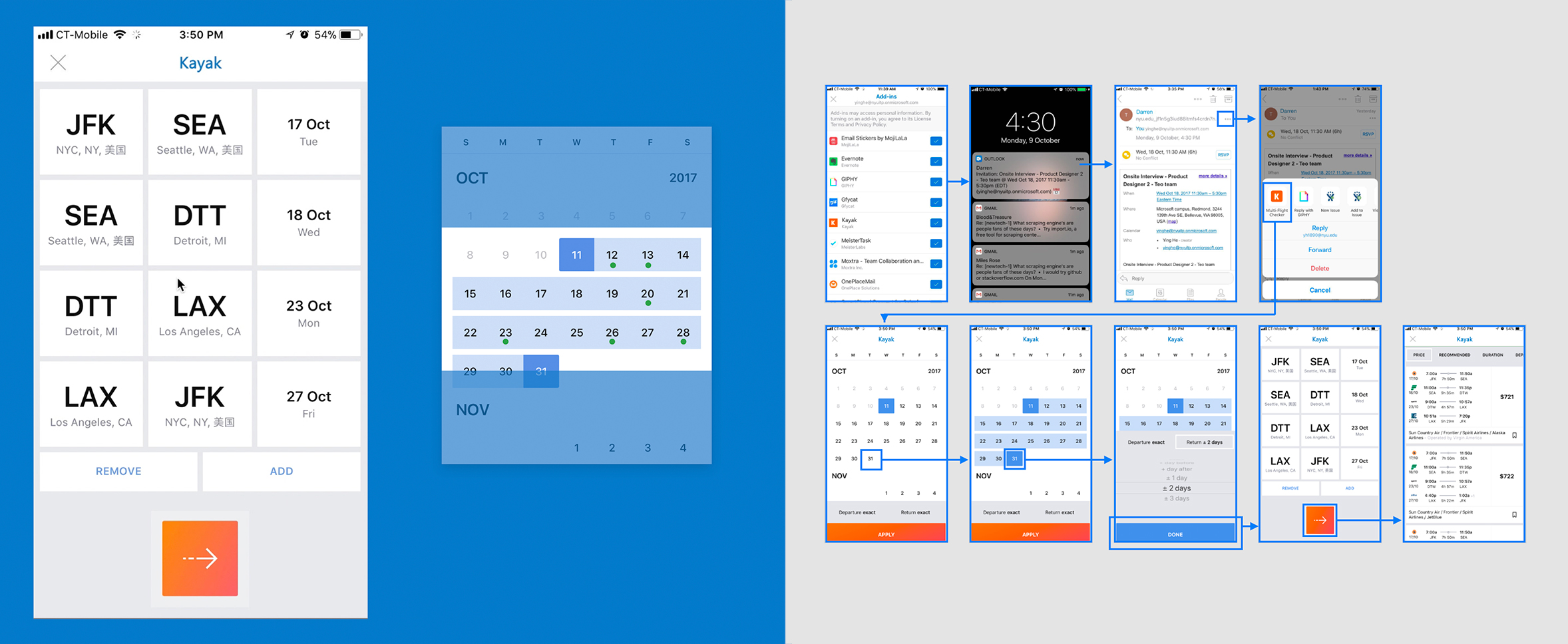
2. Multi-Flight Checker
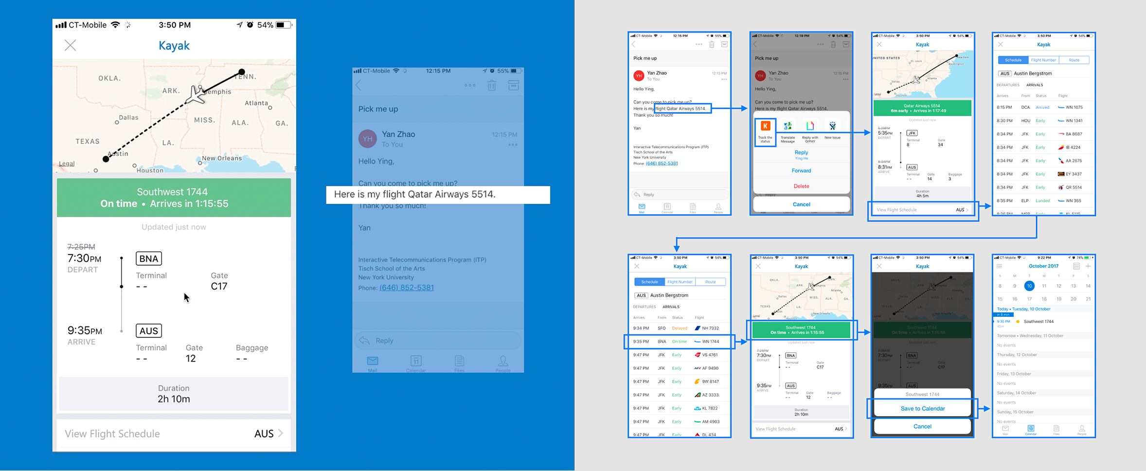
3. Track The Status
1. Prices Checker
- Fill the search form automatically based on my email information
- Save the searching information as part of your reply contant
DEMO click here
2. Multi-Flight Checker
- Combline my schedule on calendar and email
- Fill the multi-trip search form automatically based on my schedule
3. Track The Status
- Remind and track the flight status based on my email content
- Check more flight information and save to my calendar
CHALLENGE - PART 2
PROJECT BACKGROUND
How to help the user discover the appropriate integration at the right time / context?
Tools: Adobe Experience CC, Sketch, Keynote, pencil, paper
PROCESS
- Evaluate user flow with congnitive walkthrough
- Competitive analysis
- Redesign user flow
1. Use Flow

COGNITIVE WALKTHROUGH
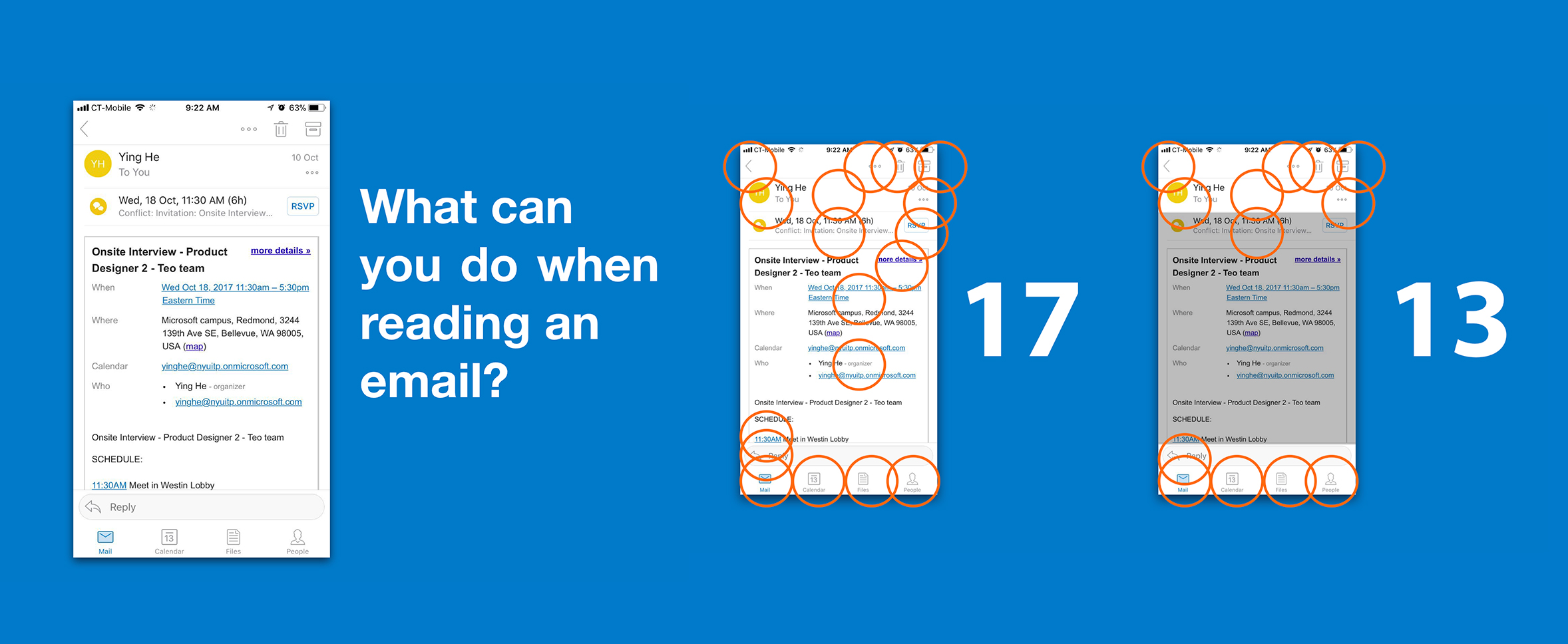
There are 2 reseaons show why most of our users they even don’t know the integrations are exist.
1.More than 5 steps from the main page to sucessfully turn on a integration
2.More than 15 functions are on a reading email page
There are 2 reseaons show why most of our users they even don’t know the integrations are exist.
1.More than 5 steps from the main page to sucessfully turn on a integration
- More Option
- Setting
- Drug down to see Add-ins
- Add-ins page
- Turn on an Add-ins function
2.More than 15 functions are on a reading email page
- Totally 17 clickable buttons inculding the clickable links in the email content
- 13 clickable functions are always appare on every page
2. Competitive Analysis
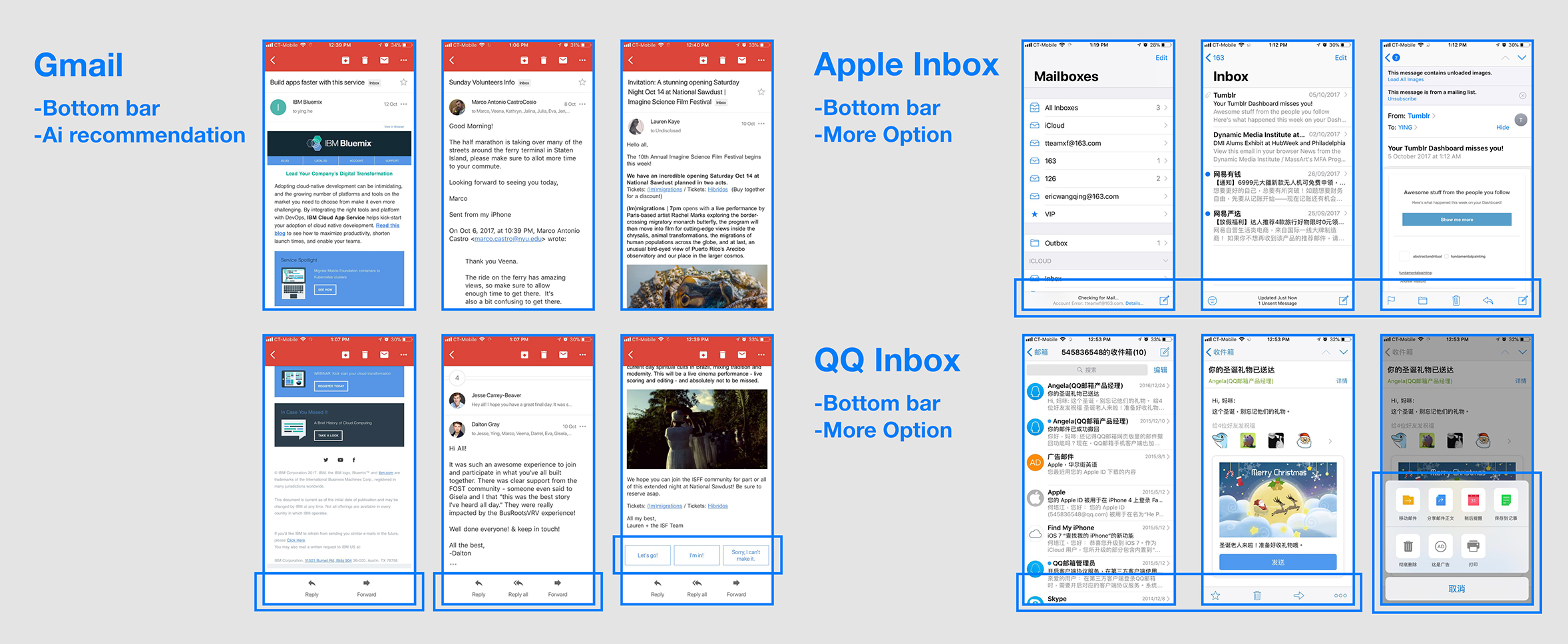
LEARN FROM GMAIL
- Gmail provides the appropriate operation according to diverse contents of the email
- Gmail provides AI reply recommendation at the bottom of the email content
BOTTOM BAR
- Gmail, Apple Inbox, QQ Inbox have dynamic bottom bar
3. Redesign user flow
DESIGN HIGHLIGHTS
Based on research, I try to redesign the user flow of helping user how to use Kayak integration in the following aspects:
1. Add a short function introduction when user first turn on an integration
2. Redesign the bottom bar of email reading page
3.Change the content into a smart button to accesss the Kayak integration in the reading email page
SKETCH WIREFRAMES
Quick sketch of the wireframes of the screens or part of the screens. Paper prototyping is especially effective in combing through user flow, as well as adjusting basic layouts, button types, etc.
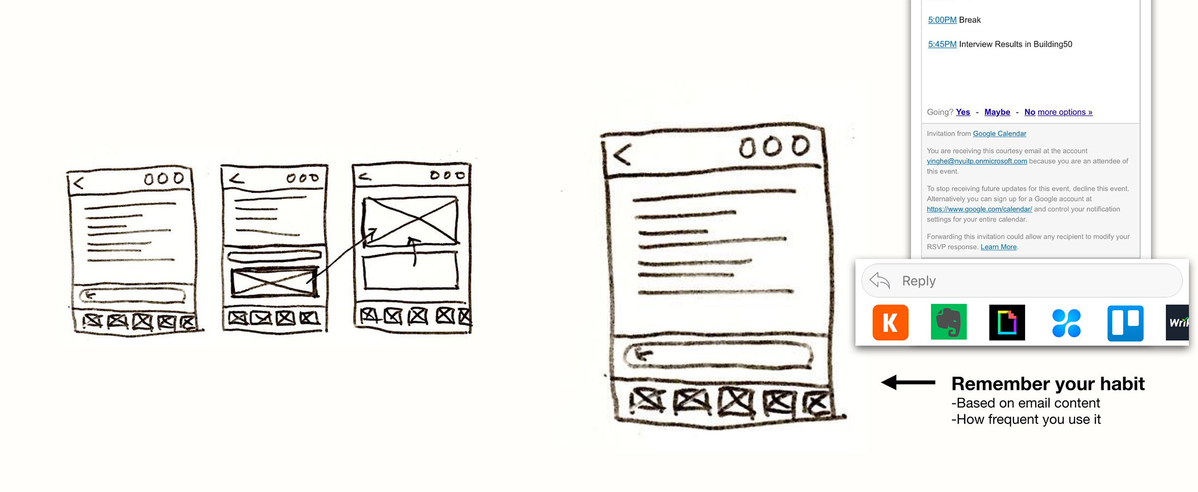
Prototype Design
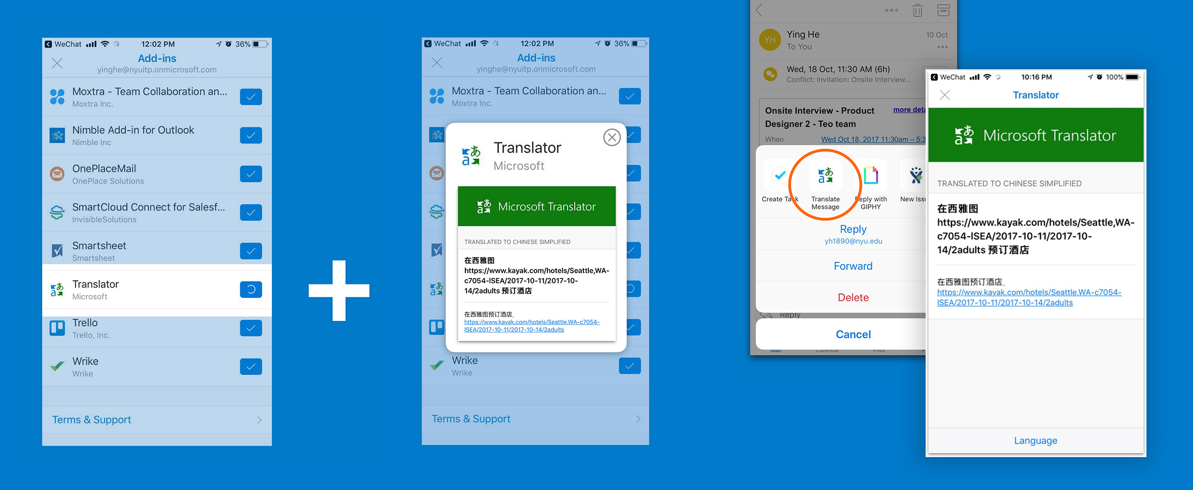
1. Feature Introduction
- Detect if the user first turn on an integration
- Show the short function introduction(screenshot / video )
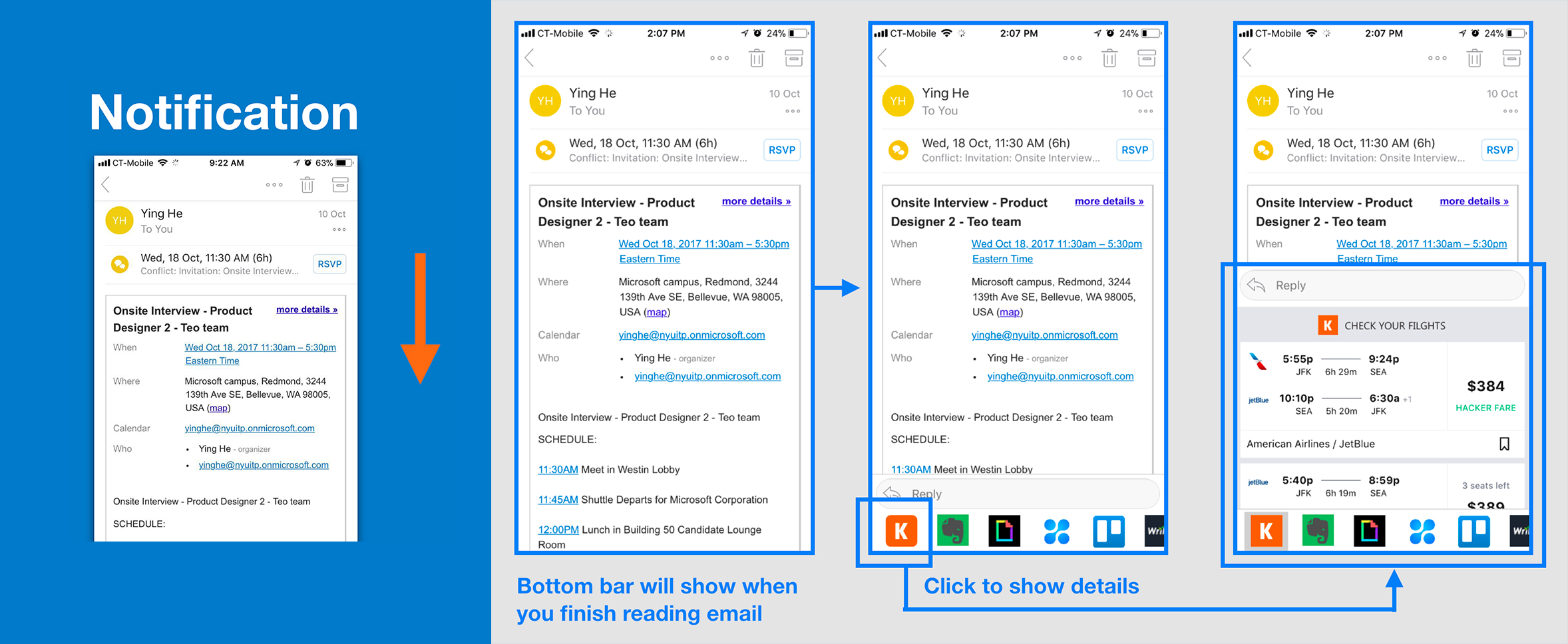
2. Dynamic Bottom Bar
- Detect if user need to reply this email (if not, show more integration in the bottom bar)
- Show the bottom bar when user finish reading email and stop
- Finish the text analysis and fill the search form automatically
- Click to show more information of the integration
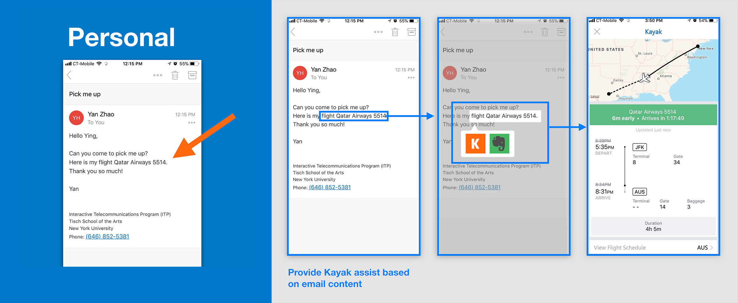
3. Conversation Bubble
- Detect if this is a personal email
- Conversation Bubble popup when it detects you need it, even before you finish reading the email
-
Thanks for reading
feel free to leave your comment via email: ying.he@nyu.edu
feel free to leave your comment via email: ying.he@nyu.edu